File:Guestbookicon.PNG
Guestbookicon.PNG (60 × 58 pixels, file size: 456 bytes, MIME type: image/png)
Display a guestbook on your site which your visitors can use to leave you a message or log their visit.
Where to Find
This Component can be found in the "Add Block to Page" section of the Toolbar.
Adding to Website
After selecting this Component, you will be able to choose exactly where you want to add it!
You will see all available content locations it can be added to - on the current page only (content locations in Gold), on every page (content locations in Red), or on every page under the current page directory (content locations in Blue. For example - if you are editing a page called "About", the blue content locations would allow you to add this component to all pages under the /about/ directory).
Options
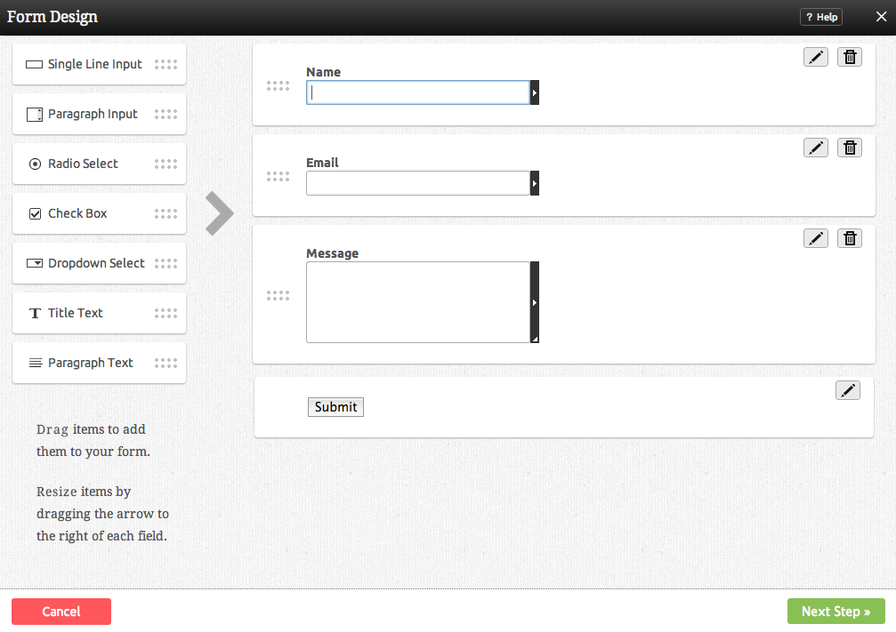
You can drag any of the following items from the left column into the "Drag" areas of the Form fields:
- Single Line Text - A box for a simple single line of text to be entered. Great for names and e-mail addresses.
- Multi Line Text - A box for multiple lines of text to be entered. This is better for paragraphs and addresses.
- Radio Buttons - A tool for allowing the form user to choose between selections or options, such as "yes" and "no". An choice can be made and changed, but not removed completely.
- Check Box - A simple check box for tasks such as asking the user whether they would like to sign up for your mailing list. Can be selected or deselected.
- Select Box - A tool for allowing the user to make a choice between items in a drop down box. Great when allowing the user to choose their country of residence, for example.
The Submit button is required and cannot be removed, however you can change the text that displays on the button, or choose an image instead.
Note: Clicking the edit icon beside a field will allow you to make the field mandatory!
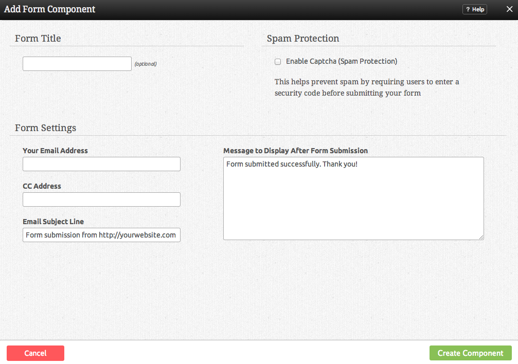
Further configuration can be done before the Component is added.
You can optionally set a Title to be displayed above the form content on your page.
When visitors fill out your form, their information will be sent to the E-mail address specified here.
The Subject line of the submission e-mail you receive can be set here.
The Confirmation Message is the message users will see upon completing and submitting their information.
Note: Submitting a form that does not have an 'Email' field will send the email with the from address as: noreply@yourdomain.com.
Editing
Need to make a change? You can access the settings for this Component again by clicking on the "Settings" button on the Component Toolbar.
Example Sites
An example of this Component can be viewed on the Web Tools page of http://builderexample.com
File history
Click on a date/time to view the file as it appeared at that time.
| Date/Time | Thumbnail | Dimensions | User | Comment | |
|---|---|---|---|---|---|
| current | 10:41, 17 May 2013 | 60 × 58 (456 bytes) | Shanker (talk | contribs) | ||
| 10:17, 17 December 2012 | 104 × 104 (9 KB) | Shanker (talk | contribs) |
File usage
The following page uses this file:


