Image gallery: Difference between revisions
mNo edit summary |
mNo edit summary |
||
| Line 60: | Line 60: | ||
Need to make a change? You can access the settings for this Component again by clicking on the "Settings" button on the content toolbar. | Need to make a change? You can access the settings for this Component again by clicking on the "Settings" button on the content toolbar. | ||
====Example:==== | |||
An example of this Component can be viewed on the [http://example.viviti.com/images-video Images & Video] page of http://example.viviti.com | |||
[[Category:Components]] | [[Category:Components]] | ||
Revision as of 23:30, 4 December 2008
An Image Gallery component is used for adding a number of images to your site, in a variety of ways.
Where to Find:
This Component can be found in the "Add to Page..." section of the Toolbar.
Adding to Website:
After selecting this Component, you will be able to choose exactly where you want to add it!
You will see all available locations it can added - on the current page only (content locations in Red) or on every page (content locations in Gold).
Configuring:
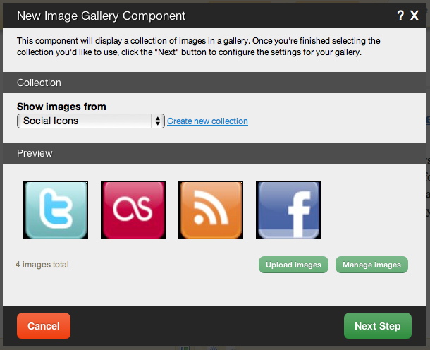
After choosing where this Component will appear, you can configure it by choosing the collection to show images from. You can also create a new collection.
Clicking on the "click here" or "Upload images" link in the Preview area will take you to the File Manager which you can use to upload images from your computer.
Clicking on "Manage images" will take you to the main file manager area with the "Images" filter in place to only show uploaded images.
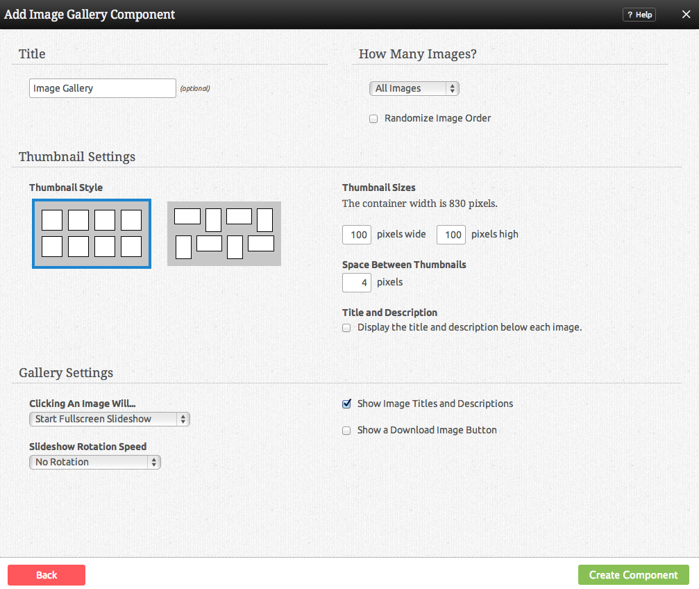
Further configuration can be done before the Component is added.
You can optionally set a Title to be displayed above the Image Gallery content on your page.
The Number of Images that display at once can be set to show all, or show only a number of the most recent images.
The Click Behaviour option will allow you to set what happens when an image in the gallery is clicked on. The choices are:
- Open Lightbox (opens the image clicked in a lightbox)
- Open Lightbox in gallery mode (opens the image clicked in a lightbox, and allows you to hover over the image to go to the next or previous in the collection)
- Link to image (Links directly to the image file)
- No click action (clicking on the image will do nothing)
The Image Size can be set to one of a variety of combinations of cropped and non-cropped.
Editing:
Need to make a change? You can access the settings for this Component again by clicking on the "Settings" button on the content toolbar.
Example:
An example of this Component can be viewed on the Images & Video page of http://example.viviti.com


