TextorContentBlockComponent: Difference between revisions
New page: A custom component is used for text and/or images. It is for creating generic content blocks where you can place whatever content you wish. ====Custom component dynamically generated htm... |
No edit summary |
||
| (19 intermediate revisions by 2 users not shown) | |||
| Line 1: | Line 1: | ||
__NOTOC__ | |||
A custom component is used for text and/or images. It is for creating generic content blocks where you can place whatever content you wish. | A custom component is used for text and/or images. It is for creating generic content blocks where you can place whatever content you wish. | ||
==Where to Find== | |||
This Component can be found in the [[Adding to a Page | "Add Content to Page"]] section of the [[Toolbar]]. | |||
==Adding to Website== | |||
After selecting this Component, you will be able to choose exactly where you want to add it! | |||
You will see all available [[content locations]] it can be added to - on the current page only (content locations in Gold), on every page (content locations in Red), or on every page under the current page directory (content locations in Blue. For example - if you are editing a page called "About", the blue content locations would allow you to add this component to all pages under the /about/ directory). | |||
==Options== | |||
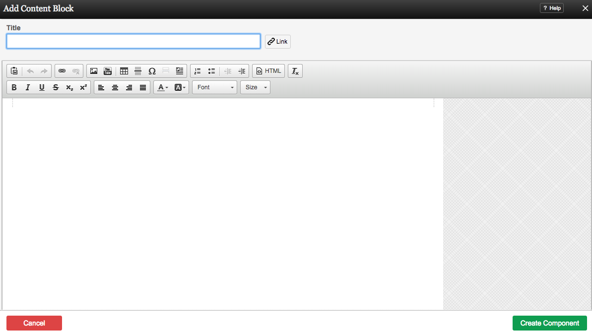
[[Image:Contentblock.PNG]] | |||
You can optionally set a '''Title''' to be displayed above the content on your page. | |||
You can use '''Content Templates''' to insert a premade content block. The available Content Templates are: | |||
* [[Image:Cb1.PNG]] '''Text with right aligned image''' - A basic column of text next to an image. Useful for about us, bios, portfolio item and other pages where the image relates closely to the text. | |||
* [[Image:Cb2.PNG]] '''Text with left aligned image''' - A basic column of text next to an image. Useful for about us, bios, portfolio item and other pages where the image relates closely to the text. | |||
* [[Image:Cb3.PNG]] '''Two small images with text''' - Great for about us pages, partnership descriptions and other pages where the images are there for reference. | |||
* [[Image:Cb4.PNG]] '''Two columns with text''' - Your standard two column layout. The infinite possibilities include stories, histories, about us and other pages with a lot of text. | |||
* [[Image:Cb5.PNG]] '''Two columns with images on top''' - This is great for describing two images on a single page, or comparing two things side by side. | |||
* [[Image:Cb6.PNG]] '''Three columns with text''' - A three column layout. Excellent for smaller text pages and ideal for lists of items or links. | |||
* [[Image:Cb7.PNG]] '''Three columns with images on top''' - This is good for comparing or writing about multiple images, or for introducing multiple members of a team and other similar pages. | |||
==Using the Image Toolbar== | |||
Built into this editor is a image hover toolbar which will help you manage the images added within it, and perform some tasks that may otherwise require coding, quickly and easily with a few clicks. | |||
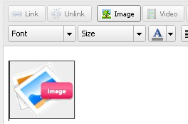
[[Image:Imagetoolbar.PNG]] | |||
To access this, just move your mouse cursor over any image. The toolbar will then appear allowing you to edit, delete, and align it in a variety of ways. | |||
==Editing== | |||
Need to make a change? You can access the settings for this Component again by clicking on the "Settings" button on the [[Component Toolbar]]. | |||
==Example Sites== | |||
An example of this Component can be viewed on the [http://builderexample.com/web-tools Web Tools] page of http://builderexample.com | |||
[[Category:Components]] | [[Category:Components]] | ||
[[Category:Web Tools Components]] | |||
Latest revision as of 14:34, 27 March 2014
A custom component is used for text and/or images. It is for creating generic content blocks where you can place whatever content you wish.
Where to Find
This Component can be found in the "Add Content to Page" section of the Toolbar.
Adding to Website
After selecting this Component, you will be able to choose exactly where you want to add it!
You will see all available content locations it can be added to - on the current page only (content locations in Gold), on every page (content locations in Red), or on every page under the current page directory (content locations in Blue. For example - if you are editing a page called "About", the blue content locations would allow you to add this component to all pages under the /about/ directory).
Options
You can optionally set a Title to be displayed above the content on your page.
You can use Content Templates to insert a premade content block. The available Content Templates are:
Text with right aligned image - A basic column of text next to an image. Useful for about us, bios, portfolio item and other pages where the image relates closely to the text.
Text with left aligned image - A basic column of text next to an image. Useful for about us, bios, portfolio item and other pages where the image relates closely to the text.
Two small images with text - Great for about us pages, partnership descriptions and other pages where the images are there for reference.
Two columns with text - Your standard two column layout. The infinite possibilities include stories, histories, about us and other pages with a lot of text.
Two columns with images on top - This is great for describing two images on a single page, or comparing two things side by side.
Three columns with text - A three column layout. Excellent for smaller text pages and ideal for lists of items or links.
Three columns with images on top - This is good for comparing or writing about multiple images, or for introducing multiple members of a team and other similar pages.
Using the Image Toolbar
Built into this editor is a image hover toolbar which will help you manage the images added within it, and perform some tasks that may otherwise require coding, quickly and easily with a few clicks.
To access this, just move your mouse cursor over any image. The toolbar will then appear allowing you to edit, delete, and align it in a variety of ways.
Editing
Need to make a change? You can access the settings for this Component again by clicking on the "Settings" button on the Component Toolbar.
Example Sites
An example of this Component can be viewed on the Web Tools page of http://builderexample.com


