ShareButtonsComponent
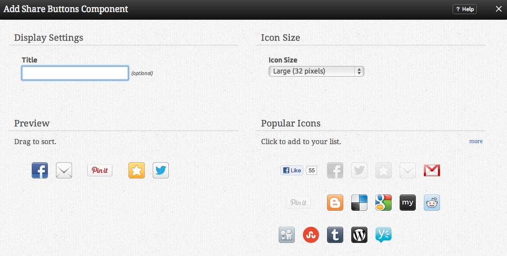
The Share Buttons Component component displays icons from a variety of popular social networking sites that allow you to connect your site and it's pages to these networks.
Where to Find
This Component can be found in the "Add Content to Page" section of the Toolbar.
Adding to Website
After selecting this Component, you will be able to choose exactly where you want to add it!
You will see all available content locations it can be added to - on the current page only (content locations in Gold), on every page (content locations in Red), or on every page under the current page directory (content locations in Blue. For example - if you are editing a page called "About", the blue content locations would allow you to add this component to all pages under the /about/ directory).
Options
You can optionally set a Title to be displayed above the topic content on your page. Icon Size will display the icons in small or large versions.
Simply drag the icons you want from the right pane to the left to add them to your site. The order can also be changed by dragging components in the active pane. To remove icons, just hover over the icon until you see an 'x' below it.
Editing
Need to make a change? You can access the settings for this Component again by clicking on the "Settings" button on the Component Toolbar.
Example Sites
An example of this Component can be viewed on the Social Networking page of http://builderexample.com

